Blog
How a new page layout makes word cloud generating easier than ever
An overhaul of the Create page helps you make word clouds with more control and less effort. So what has changed and why is it better?
First of all, there’s no need to panic, all the old settings are still there. This redesign has focussed more on where to locate the settings than changing what they look like or how they behave. That means you will recognise a lot of the old look, which will ease the transition.
Even if the insides remain familiar, the overall layout has significantly changed, with the aim of making settings easier to find and understand.
Do you control your settings or do they control you?
The way a web app organises its settings has a big impact on how simple it is to use. Complicated websites – like WordItOut – have lots of settings. All these options are part of what makes these apps great, you can completely customise and tweak to get exactly the result you want.
However, all this control should not get in your way and become frustrating.
We’ve all been on apps where you spend ages trying to find the one setting you need. Or you know where the option is, but have to go through so many sections just to get there. Sometimes I stare at a button, trying to guess what clicking on it will do. Other times there are multiple choices and I don’t know what the differences are.
These kind of issues can be reduced or eliminated and without these distractions, you focus on what you came to do. You become more productive and you may even enjoy accomplishing your task.
I’ve applied this thinking to WordItOut in several ways.
More than one type of original source
As soon as you arrive at the Create page, you notice that it has a new sidebar.
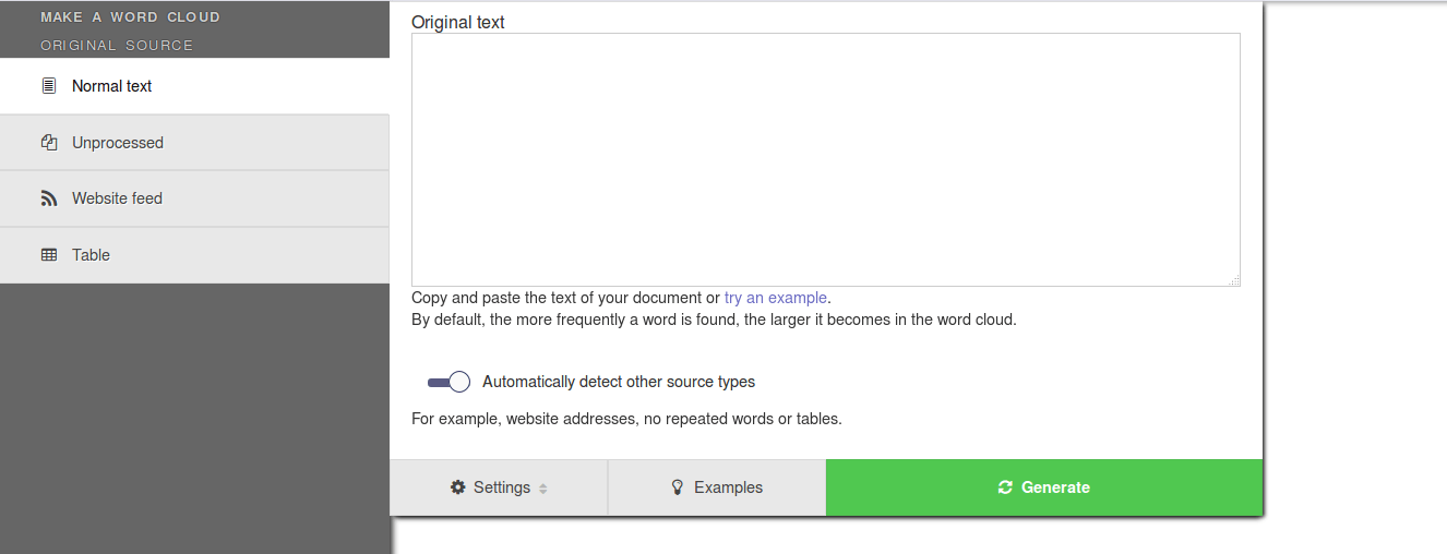
When you hover or tap on the categories of the sidebar, the relevant menu pops out.
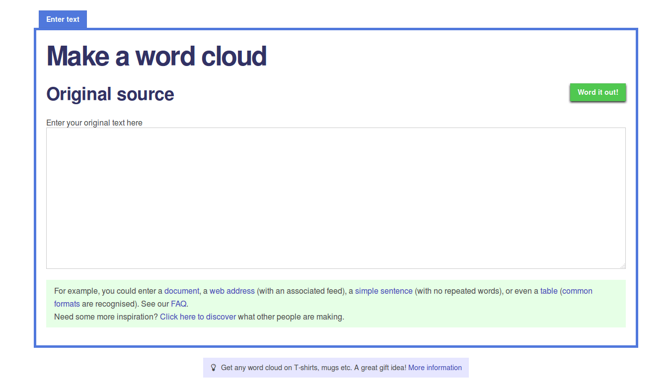
The sidebar explicitly shows the different types of sources from which you can make a word cloud. These have always existed: the old text box would automatically detect other types once you started generating the word cloud. However, in the old version this was easy to miss as it was only explained in a long paragraph below the main text box.
In the new look, the first menu still automatically detects other source types (there is also an option to prevent this from happening). But now you can choose: go directly to a specific type or conveniently use the first box like before.
Different options for different sources
There are other advantages to explicitly splitting up the types of sources. For example, a note will appear if a text box is not correctly formatted. Also, with tables as a source, a preview of your text data appears while you edit.
Settings related to your text input are now immediately available, and you only see those which apply to the current type of source. Previously, you couldn’t even alter these settings until you had generated a word cloud, and then you had to go back and regenerate.
Each source type also has its own examples. These too were hidden in the old design (in the paragraph under the text box) but are now much more visible.
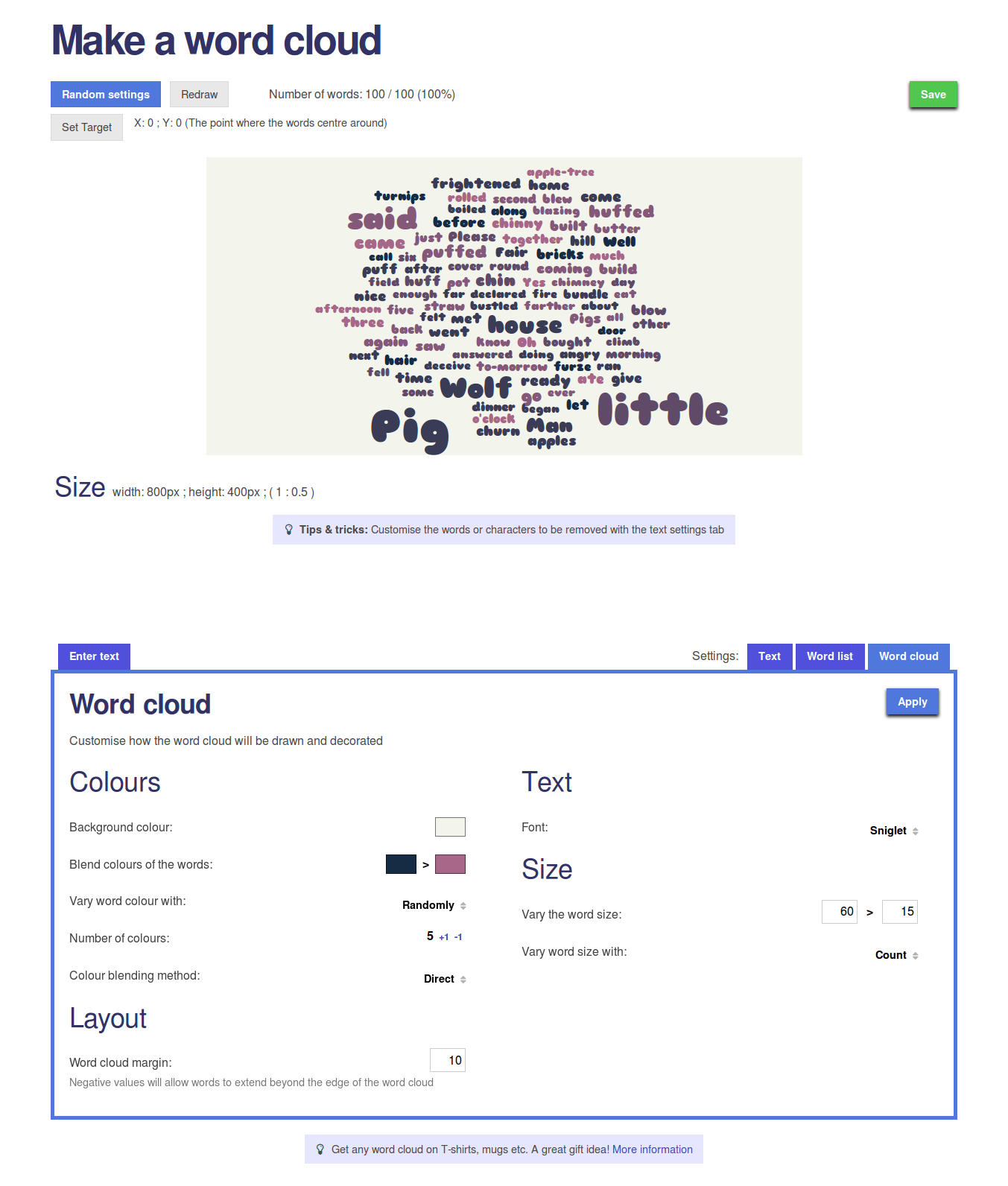
Grouped settings in the sidebar
Once you generate a word cloud, the sidebar replaces what used to be tabs below the word cloud. The menus group together related settings. The top ones contain the main word cloud settings, the ones you use most and therefore they are the easiest to access. The last one lets you edit the Word list (exactly like the old tab did).

Grouping options into the sidebar adds many advantages over the old design.
- Placed beside the word cloud, you don’t need to scroll all the time: up (to see the word cloud and regenerate it) and down (to alter settings).
- The menus reduce clutter on the screen, so you can focus on just one thing at a time.
- The left is now the place to look to when you want to make a change, not searching through the whole page.
- Whilst you’re making changes, you can see the current version of the word cloud behind.
To randomly regenerate, or not?
The sidebar is clearly a central component to the new layout. Within it are not just menus, but also very important buttons.
The regeneration button is the most pressed on the whole website. Some people find it very addictive and no doubt a few computer mice have been broken because of it. Previously there were two of them above the word cloud, as well as a few ‘Apply’ buttons in the old tabs.

Clearly, there was confusion as to what the differences were. In short, one button randomised the main word cloud settings, whilst the others simply repositioned the words randomly, keeping all settings the same.
Now, however, there is only one regenerate button. No doubt which button to press then, but how do you know which settings might be randomised?
Well, like before, most settings won’t change when you press the regenerate button. Some menus can randomly alter their group of settings when you press the regenerate button.
This is controlled with switch buttons. They are on at the start, so by default the new Regenerate button works like the old ‘Random settings’ button.
Except now you can swtich these buttons off (or back on again). If they are all off, the new Regenerate button just repositions the text of the word cloud, as the old ‘Redraw’ button used to.
Conveniently, these switches are duplicated in the sidebar as a shortcut for very rapid swapping of ‘random on regenerate’ or not.
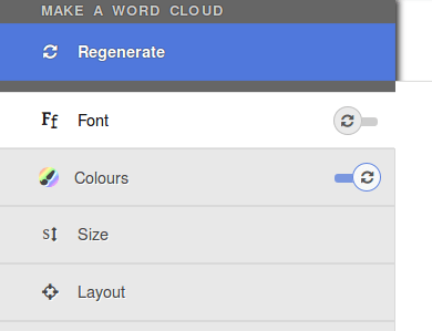
These buttons are smart too. They are automatically set to off if you make a change to any of the settings in that menu.
There are two other important buttons in the sidebar: going back to the original source sidebar, and opening the save window.
A sign of things to come
As you can see, there are several alterations, despite the fact that I have tried to make as few changes as possible in one go (to give everyone time to familiarise themselves).
For the past couple of years, many changes have been added to WordItOut behind the scenes. This latest update is just a part of a whole series of improvements and updates planned for this website.
That means improving how WordItOut works on tablets and mobiles, which the new layout helps with (though there is still work to be done). People on smaller screens will notice, for example, how the sidebar becomes thinner.
Having menus in a sidebar will also make it easier to organise other new features in the future, such as making words appear vertically or at angles.
From now on, more and more of the changes will be visible to you. Until the new ones arrive, try out the new generate a word cloud page and please let me know what you think.
Monday 17 August 2015